How do you revive a historic brand while managing the emotional equity of its legacy communities? From zero followers, I built a complete omni-channel identity transformation—designing official insignia, launching web ecosystems, and engineering a community-led governance strategy that scaled our footprint to 140,000+ active advocates.
Strategy at a Glance:
- Audience Zero-to-One: Established an enterprise digital footprint entirely from scratch, scaling to 140,000+ active followers.
- Workforce Alignment: Unified an internal culture of 11,000–14,000 distributed personnel under a single cohesive brand narrative.
- Multi-Channel Media Launch: Orchestrated a series of televised national launch ceremonies, public relations escorts, and an executive podcast series.
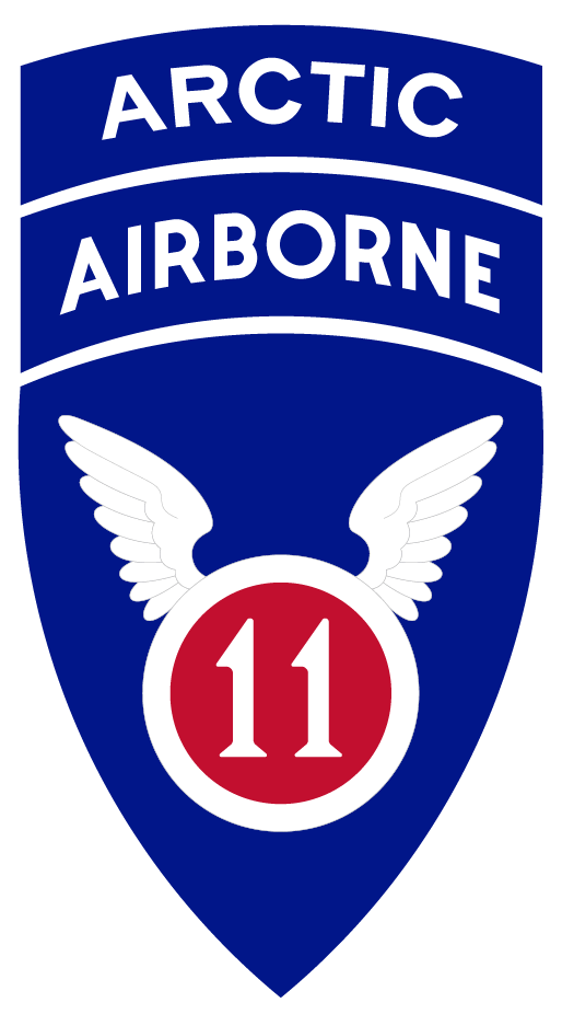
Original artwork
This is part of the original artwork which I created for the launch of the 11th Airborne brand. It was designed according to the specifications of The Institute of Heraldry, within their design system.
Benjamin Wilson
Rebranding an active organization is notoriously complex; resurrecting a historical brand with deep legacy ties is an exercise in community building and diplomacy. The 11th Airborne Division had a heritage going back to World War II, but zero modern footprint. My directive was twofold:
- First, I needed to build a complete digital and physical brand identity from the ground up—including official insignia, visual design systems, web properties, and communication channels.
- Second, I had to introduce this identity to an internal workforce of 11,000-14,000 people in Alaska, while simultaneously managing the emotional equity of external historical communities who viewed the historic brand as explicitly theirs.
Rather than pushing a top-down rollout that could alienate established communities, I kicked off a community-first alignment strategy.
The strategy:
1. Generating Community Ownership:
I actively engaged with online historical groups and legacy communities early in the design cycle, which worked well in later stages, as they became my biggest allies. By treating them as key stakeholders and integrating their feedback into the visual storytelling, we transformed potential gatekeepers into passionate brand ambassadors.
2. Internal Cultural Alignment:
To cascade the new identity down to 14,000 distributed team members across Alaska, we developed an internal communications architecture consisting of social messaging, print collaterals, short-form videos, targeted messaging, and an authoritative internal messaging framework to ensure absolute alignment of the new brand voice.
With the community foundation secured, I engineered the division’s new look and feel; artwork, digital real estate, and public launch mechanics.
3. Visual and design assets:
I dusted off my art school degree and created a lot of design artifacts; the new insignia, posters, videos, lower-thirds, and some very Army-specific things like beret tabs, flashes, and distinctive unit insignia.
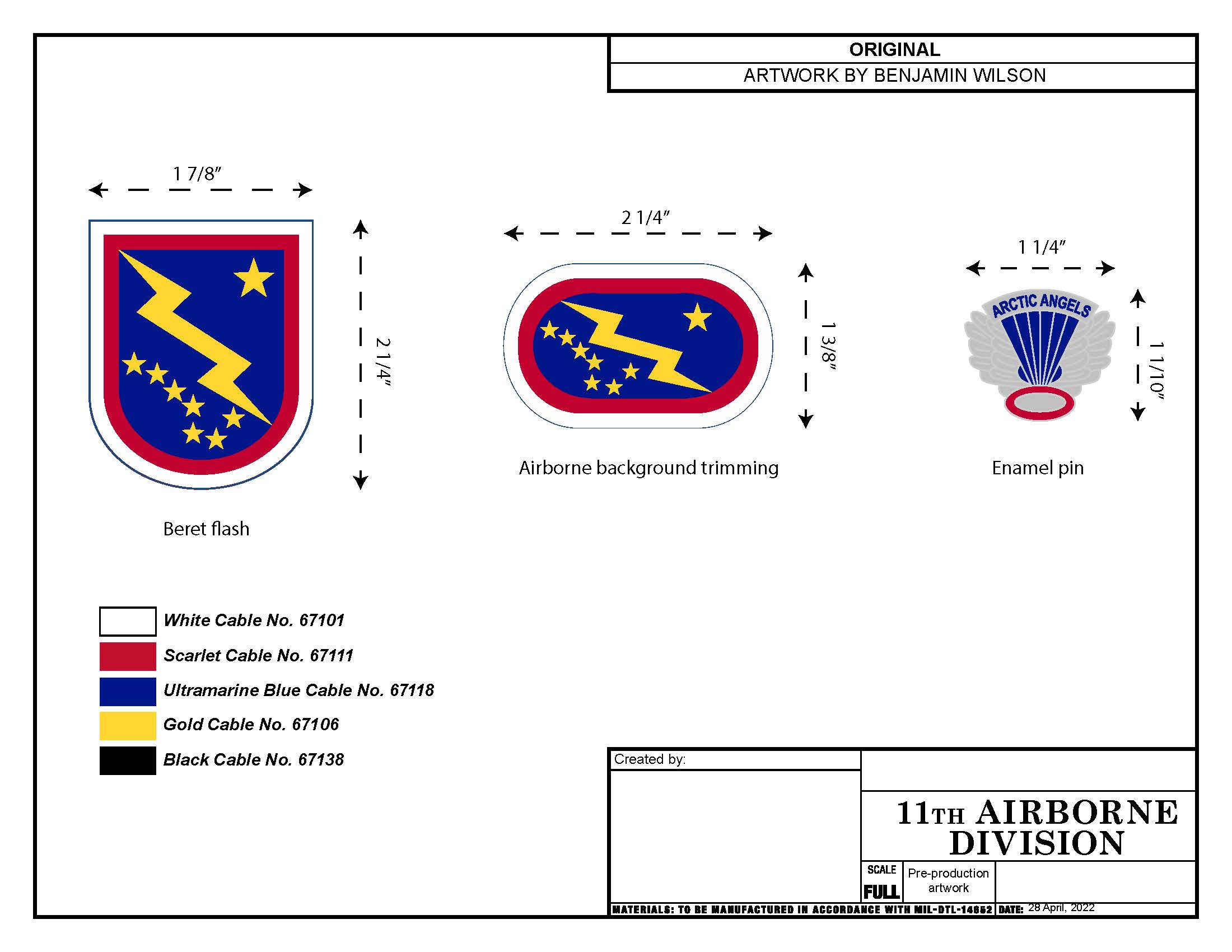
Original artwork
This is part of the original artwork which I created for the launch of the 11th Airborne brand.
Benjamin Wilson
4. Information Architecture & UX:
I built the division’s entire digital presence from a baseline of zero followers. This involved creating new social media accounts, designing a fresh web layout, executing exhaustive user research, wireframing new information architectures, and conducting strict accessibility audits to pass web compliance frameworks.
5. The Launch Blueprint:
We executed an omni-channel media launch that integrated traditional and digital touchpoints. I directed a series of televised launch ceremonies, managed media and legislative escorts for VIP stakeholders, and conceptualized and launched a dedicated podcast series to deepen audience engagement.
The rebrand achieved total cross-functional alignment. By treating community management as a form of governance, the project scaled our digital audiences from zero to over 140,000 active followers. Furthermore, the physical brand assets I designed—including official organizational insignia, tabs, and flashes—were officially adopted and remain the permanent, living visual identity of the organization to this day.